Gifted reviews - from 25% to 5% missing reviews
| Skeepers |
Introduction
25% of missing reviews impacted client retention. By transforming the user flow into a step-by-step guide, I reduced the number of missing reviews to 5% in two weeks.
My role: Product Designer
Team: Product manager, Lead developer, iOS developer, Full stack developers, QA
Stakeholders: Head of product, Care team, Customer success managers
Timeline: 2 weeks + 6 weeks for measuring
25% of content creators skipped the end of the user flow
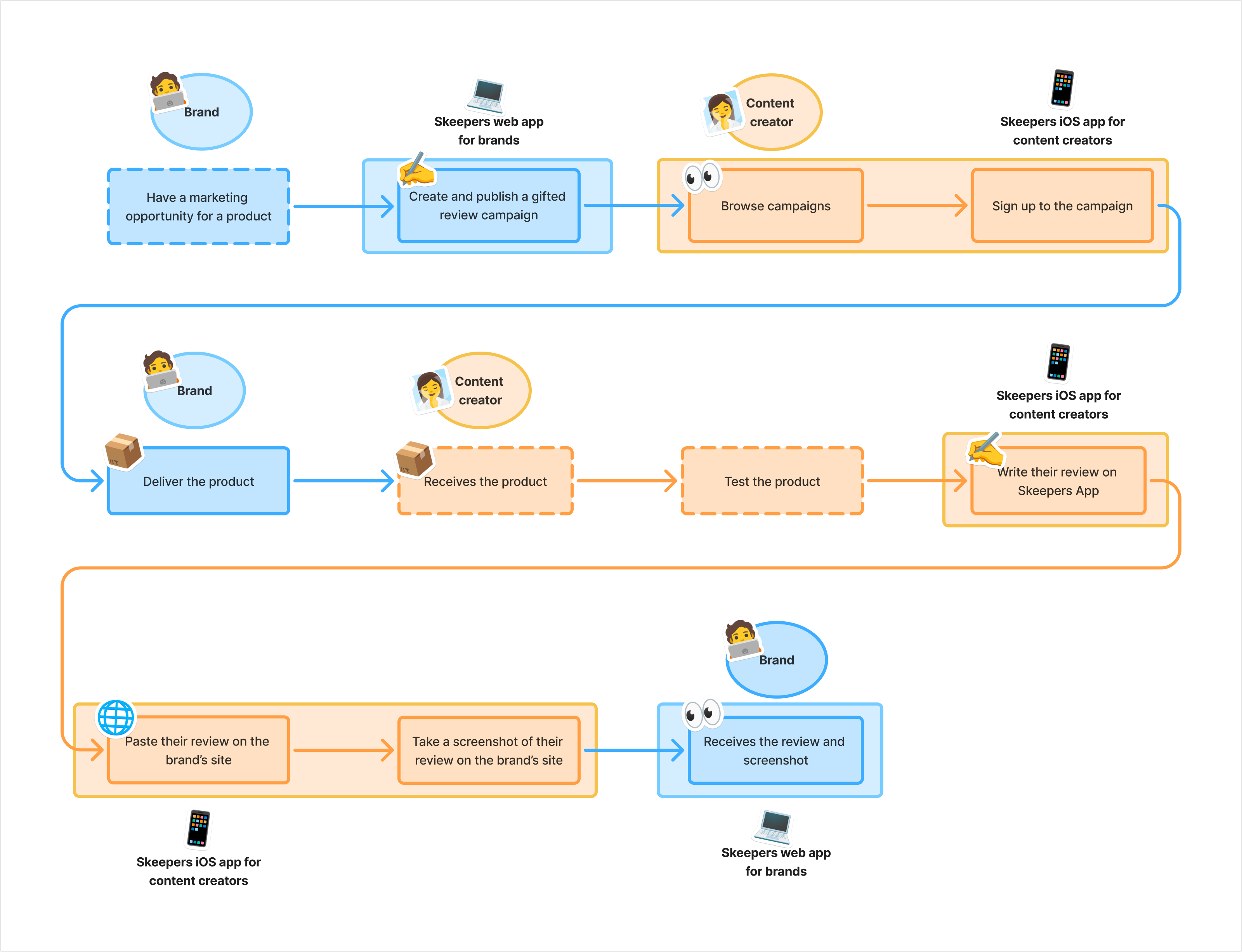
Skeepers is a mobile app for content creators: they apply to campaigns made by brands and if they are selected they will receive a free product and then write their review on a provided website. This is what Skeepers call a “Gifted review campaign”.
Clients (mostly in skin care) use Skeepers to create gifted reviews campaigns and receive multiple reviews on their e-commerce website, which optimises SEO and increases sales.
The mobile app has around 113,000 active users, with around 33,000 gifted reviews campaigns being published every month.
I received insights from customer success managers and clients that they were missing around 25% of reviews on their gifted reviews campaigns. I decided to investigate alongside the Head of Product, Product manager and developers on this matter as it was an opportunity to improve clients retention.
Two weeks to reduce the number of missing reviews by half
Constraints
- Manual measurement only.
- No control over clients’ websites.
My goal was to test a solution that would work for all clients without any technical challenges within a timeframe shorter than usual (two weeks). The stakeholders decided on the short timeline in order to quickly answer the clients’ pressing questions. The test would be successful if it reduced the number of missing reviews by half.
I had two major constraints:
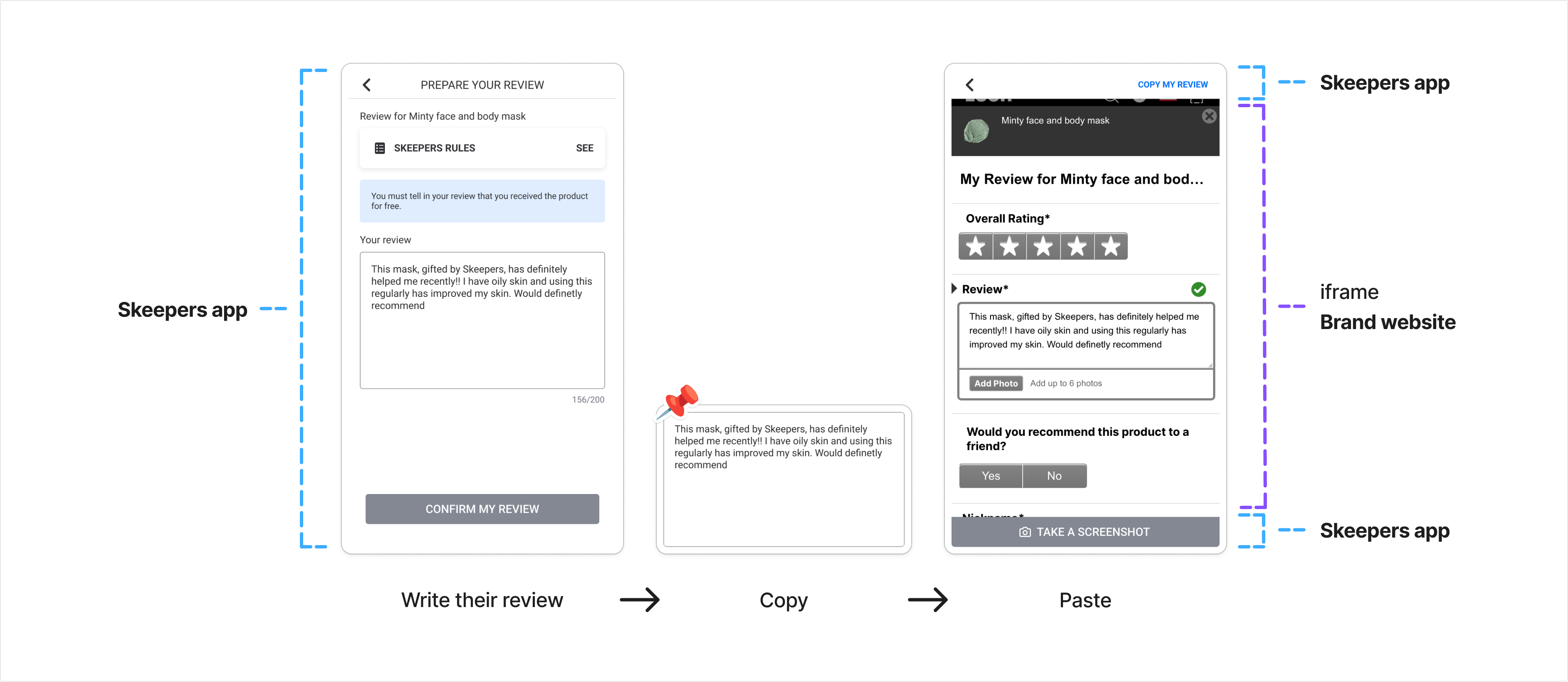
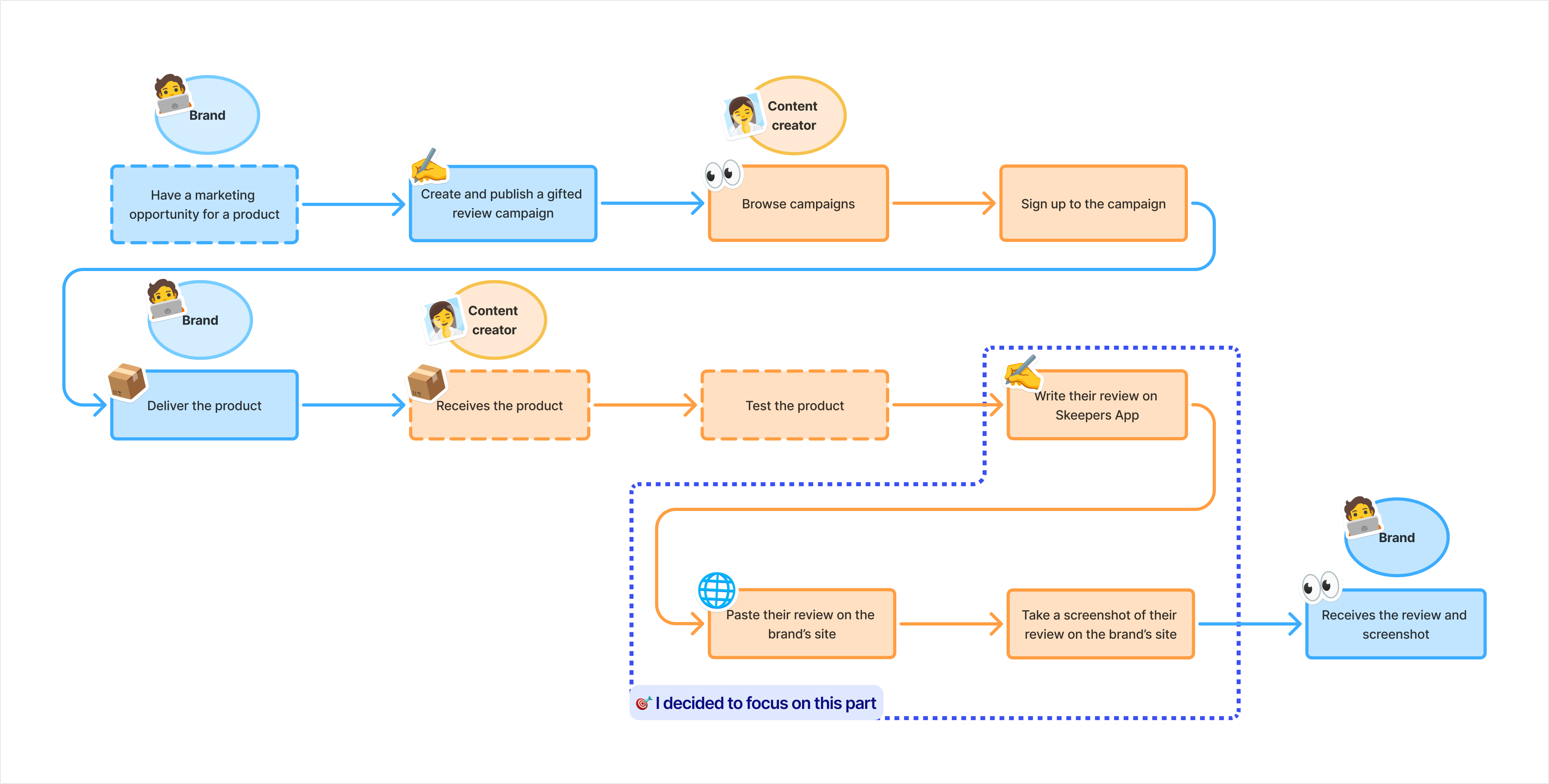
- We cannot measure automatically the reviews published on the brands website as we do not control it. In the current version, content creator write their review on the Skeepers app and then paste it on the client website.
- The section where content creators publish their review on the clients websites are all different. Some requires to create an account, some needs long scrolling to reach it and some clients send a wrong link in the campaign. And then again, we can’t control the client’s website.
So I decided:
- To measure manually on one client only, every week for six weeks. It will help to identify if the solution tested is a success or not.
- To focus on the content creator user flow, because that’s where there will be more impact. Even if I know that the user flow for the clients can be improved to reduce some errors.
5 solutions explored, 2 prototyped
Research uncovered a guidance problem
Adapting the user research process
I conducted a recruitment campaign to test prototypes with real users but as I received no responses, I improvised and adapted:
- I adapted an already planned user interview with a content creator, by adding questions about the current user flow for gifted reviews.
- I joined forums, Reddit pages, Telegram groups used by our users to monitor their feedback. They were struggling with the experience and asked how to submit their gifted reviews.
A feedback found on Reddit
Why content creators miss the final step
My research confirmed my intuitions:
- Content creators don’t understand that they have to publish their review on two destinations (Skeepers app first and then the brand’s website).
- Content creators don’t publish on the brand’s website because they don’t see the difference between the two destinations. They believe they already publish their review once they publish it on the Skeepers app.
Abandoned trails in favour of a quicker impact
Manual moderation by the Care Team
🎯 Goal
Verify if the reviews have been published and notify content creators if they haven’t.
❌ Why abandoned
Too time-consuming for the Care Team (manual work for around 33,000 of reviews each month).
Use AI to review screenshots
In the current user-flow, content creators take a screenshot of their review when publishing it in the brand website.
🎯 Goal
Alert and guide the content creator when their review isn’t visible in the screenshot.
❌ Why abandoned
Too costly and doesn’t work with every websites.
Check the link in the gifted review campaign
I discovered with the help of the Care Team that some gifted reviews campaigns have a broken link to the brand’s website. 13 campaigns with broken links affected thousands of creators in one month.
🎯 Goal
Help brands when they are creating a gifted review campaign, to avoid broken links.
🕒 Why postboned
This opportunity concerns the brand side and my focus was on the content creator side because it has more impact.
Count gifted reviews on the brand’s website
With the lead developer, I discovered that we could build a tool counting gifted reviews on the brand’s website. It’s called “parsing”.
🎯 Goal
Automatically identify missing gifted reviews on the brand website and notify the related content creators.
❌ Why abandoned
Too resource-consuming for the high number of ongoing campaigns and reviews.
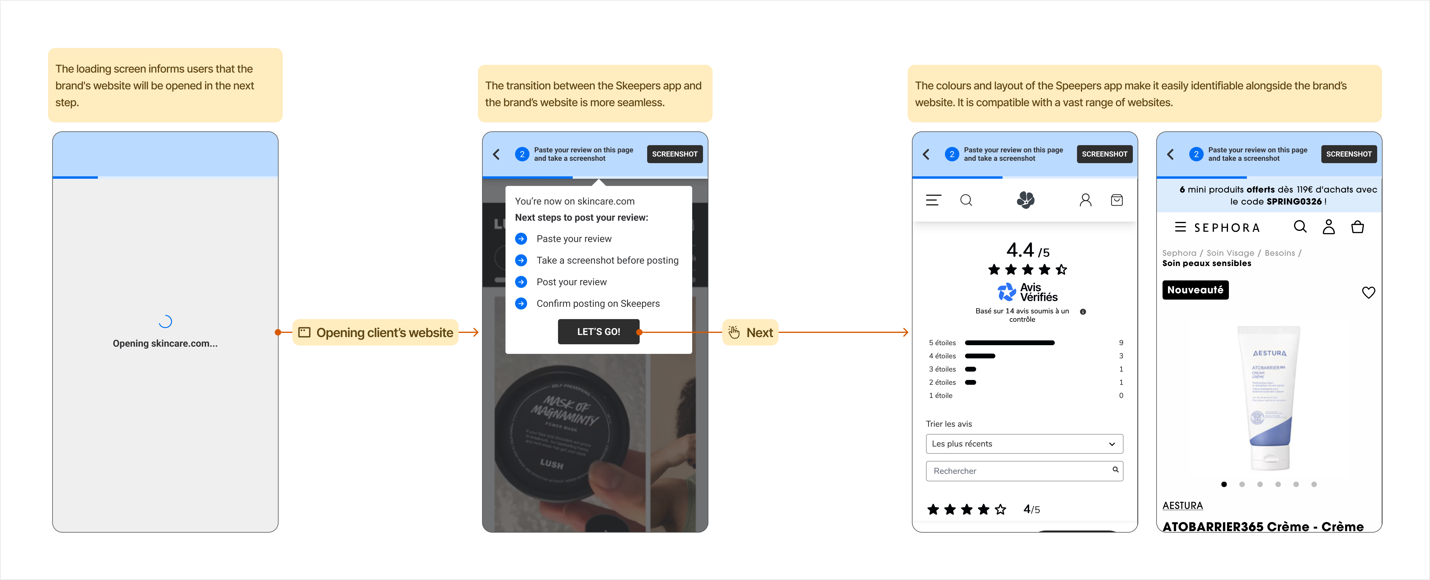
The winning solution: Step-by-step guidance
Taking into account all the points raised above, I decided to edit the current user flow, where the content creator writes their review and is then redirected to the client’s website.
Replace all unclear wording
I kept the current steps in the user flow and changed only the wordings.
This version was easy to build but I suspected that those small changes won’t have enough impact. So I decided put it aside and change entirely the user flow to aim for more impact.
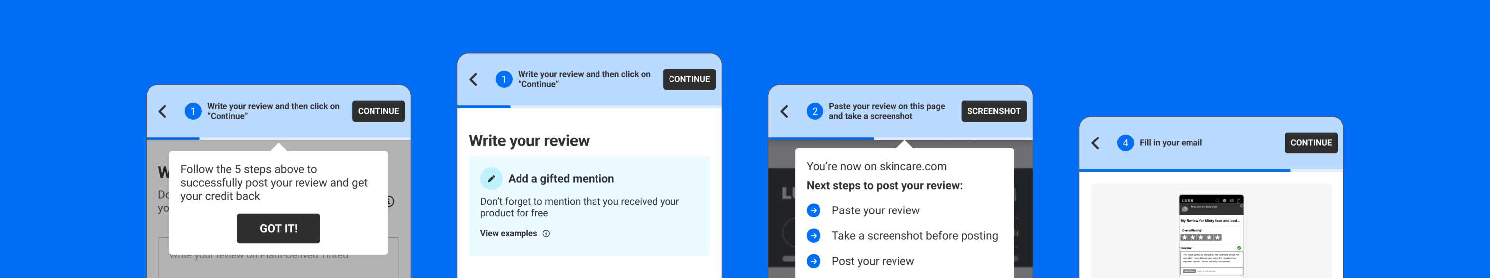
Turn the user-flow into a step-by-step guide
I decided to start afresh and transform the user flow into a step-by-step guide to help users more effectively.
Staged disclosure
I used staged disclosure to simplify the user flow. The user flow is divided into smaller steps, with each step displaying one instruction and one task. This method helps users to focus on each action and it is often used to improve the learnability and efficiency of interfaces, as well as reducing the error rate.
To guide the user through the steps, I created a consistant layout that displays key information (instructions for each step, call to action and navigation options) in the same place throughout.
Highlighting the steps on the client’s website
How to make the difference between publishing the review on the Skeepers app and on the client’s website clearer:
- Prepare the user before they are directed to the brand’s website with a loading screen and an introductory text.
- Display a clearer contrast between the Skeepers app and the brand’s website.
Pair-designing to ship in 2 weeks
Collaborating with developers
To ensure that it could be done within the remaining timeframe I changed the way I worked. I did some “pair-designing” with the iOS developer. The developer worked on it while I was designing on Figma, so we could check how it could work without delay. This approach successfully reduced the delivery time by three and enabled the team to observe the impact earlier.
Framing the changes
To avoid complex development, I managed to keep the changes in one user flow only without impacting the whole app and without impacting the user flow for the brand.
From 25% to 5% missing reviews achieved in six weeks
Results
The team measures 5% missing reviews with the new user flow, instead of 25% before the changes.
- It was checked manually with one client who had multiple gifted reviews campaigns during the timeframe.
- It was measured on a six week period.
My learnings
I loved involving developers earlier in the process, even before mock-ups:
- It can accelerate the making of a first solution.
- It’s a great way to explore technical possibilities and constraints before spending time on a possible solution.
- It’s always interesting to have different point of views and avoid being stuck on our first idea.
I also learned to adapt and find alternative ways of gathering user feedback when recruitment wasn’t working.